Killing the password. Or at least maiming it.
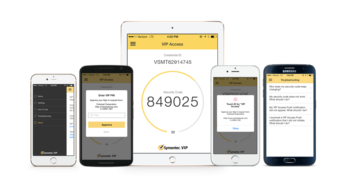
When I first started at Symantec, the VIP Access app could do one thing: provide a six-digit security code. My boss NIco Popp, Sr. VP for Information Protection, wanted more. A lot more.
My team redesigned the entire app, starting with the look & feel, but focusing on the technical leaps that would get us closer to eradicating that pesky password.
We first added push verification, which removed one annoying step from the login process (tacking on a code to the end of a network password). Next we delivered Touch ID, where you no longer needed to type in a password at all — just click a button on a website, get a push notification on your mobile device, and then tap your finger.
Primary role: User Experience Manager
Secondary roles: UX designer, usability research
Design team: Vinoth Raghavan, Shirley Lee, Franklin Shaw
Contribution: I provided guidance on the overall strategy (brand alignment, design style, product vision). I facilitated and participated in conceptual design exercises, led collaboration with engineering, and conducted usability studies.


A light-themed design motif was making its way through Symantec, but we knew that some of our end users used VIP Access in low light conditions (like logging into a network in the wee hours of the morning). Based on field research and customer feedback, we felt a dark theme was an important consideration. We looked at apps that were commonly used in low light, like an alarm on a phone, and we did color contrast research.


We strive for simplicity in our usability tests, creating scenarios that are relatable and easy to follow. We recruited a wide range of participants, even some with cataracts or color blindness, and conducted our tests in a dark room. We tested different color and contrast combinations, and took note of the success rates. We also quizzed participants on what they noticed, and what worked best for them. It's important, we feel, to observe how someone uses the product, but also gather their thoughts and opinions. It is hard to determine what is best based on pure metrics, or pure opinion. We ended up launching a dark theme that was very well received by our end users (second from left).


VIP Access Manager
When you work in enterprise software, get ready for vast differences in product user bases. How big? Well, some admin consoles could have 10 or so users. Total. That's because we might sell it to 4-5 companies, and the IT people working with the console can be counted with fingers and maybe toes.
Now take a single sign-on portal. This gets rolled out to every employee at a number of large companies, so now you're talking hundreds of thousands of users. It shouldn't change your design approach too much, but upper management tends to think UX time should be focused more on the bigger audience.
So we got asked to redesign the SSO portal, and we were glad to do it. What you see for the "After" doesn't have all the aspects of our intended design, but it's close. We significantly simplified the filters, improved the visuals, and updated the iconography.
Primary role: User Experience Manager
Secondary roles: Usability research
Design team: Vinoth Raghavan, Douglas Campbell, Franklin Shaw
Contribution: I provided guidance on the user experience and visual style. I facilitated and participated in conceptual design exercises, and conducted usability studies.
AFTER

BEFORE

MORE
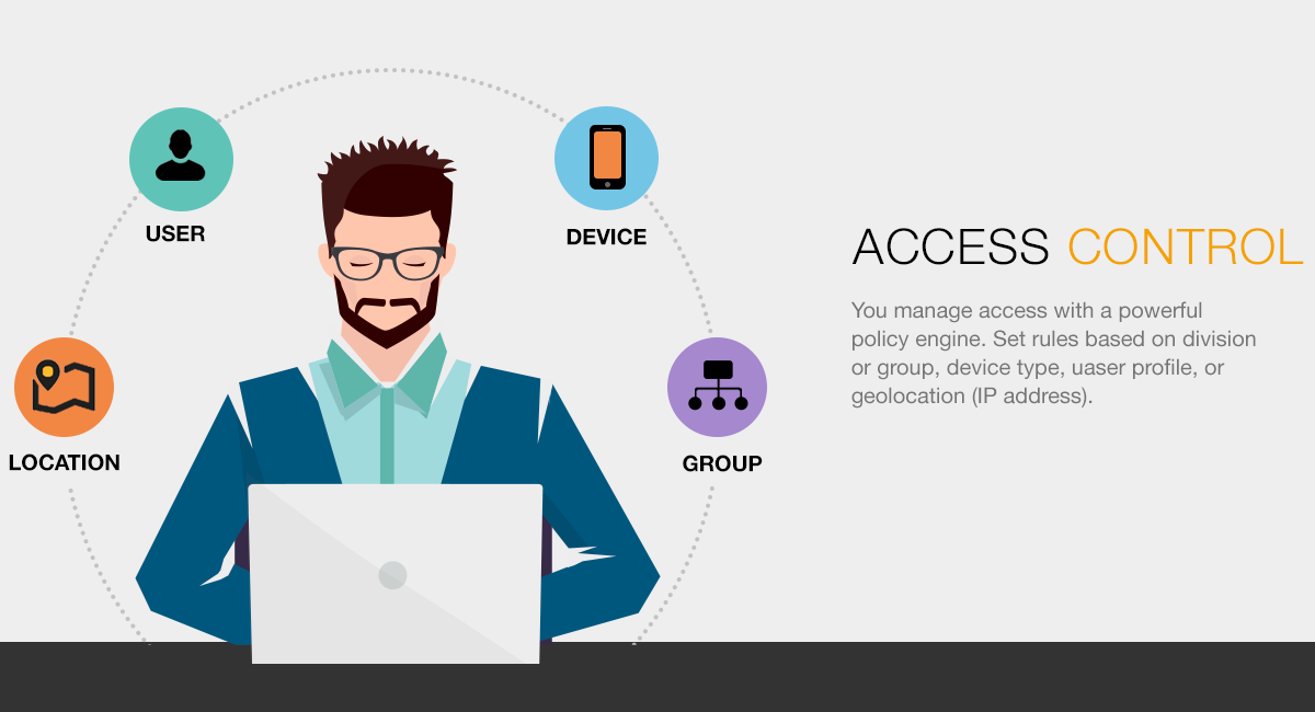
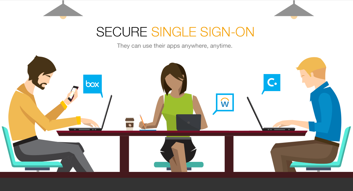
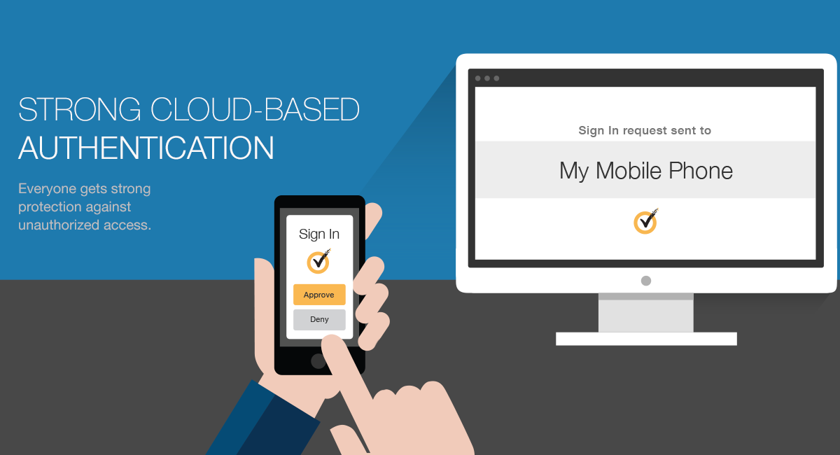
Our team was asked to do a product microsite to help promote the single sign-on portal. I worked with a very talented designer on my team, Shirley Lee, to concept these three hero banners for the site. This was a side project with a tight turnaround, so we did a shortcut and purchased illustrations from iStock, and then she made significant changes to them. She is a good illustrator, but in a time bind, purchase and re-purpose can be effective.