How we work.

I encourage our teams to vigorously challenge ideas, yet maintain a really positive, collaborative spirit. We celebrate and reward individual contributions — they don't get mushed into a blob of group insights — but we get a range of feedback before drawing any conclusions (this can come from customers, leadership, cross-functional teams, other designers, etc.)

This has helped us produce better work, retain talent, and create a culture of design that works.

Killing the password. Or at least maiming it.

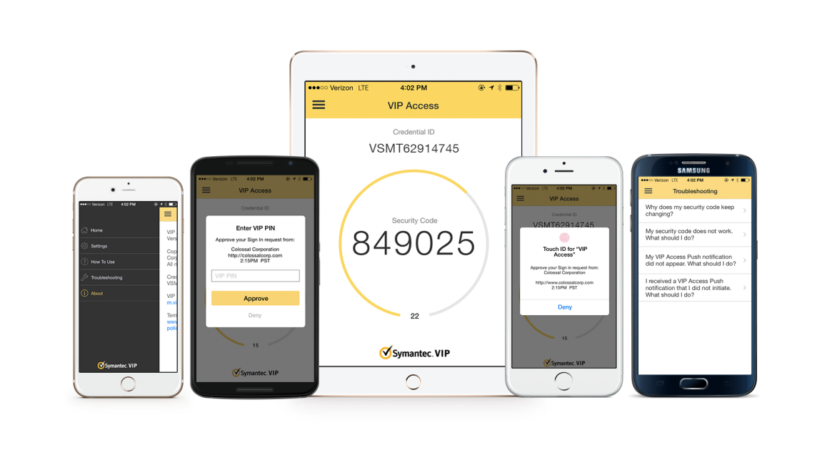
When I first started at Symantec, the VIP Access app could do one thing: provide a six-digit security code. My boss NIco Popp, Sr. VP for Information Protection, wanted more. A lot more. 

My team redesigned the entire app, starting with the look & feel, but focusing on the technical leaps that would get us closer to eradicating that pesky password.

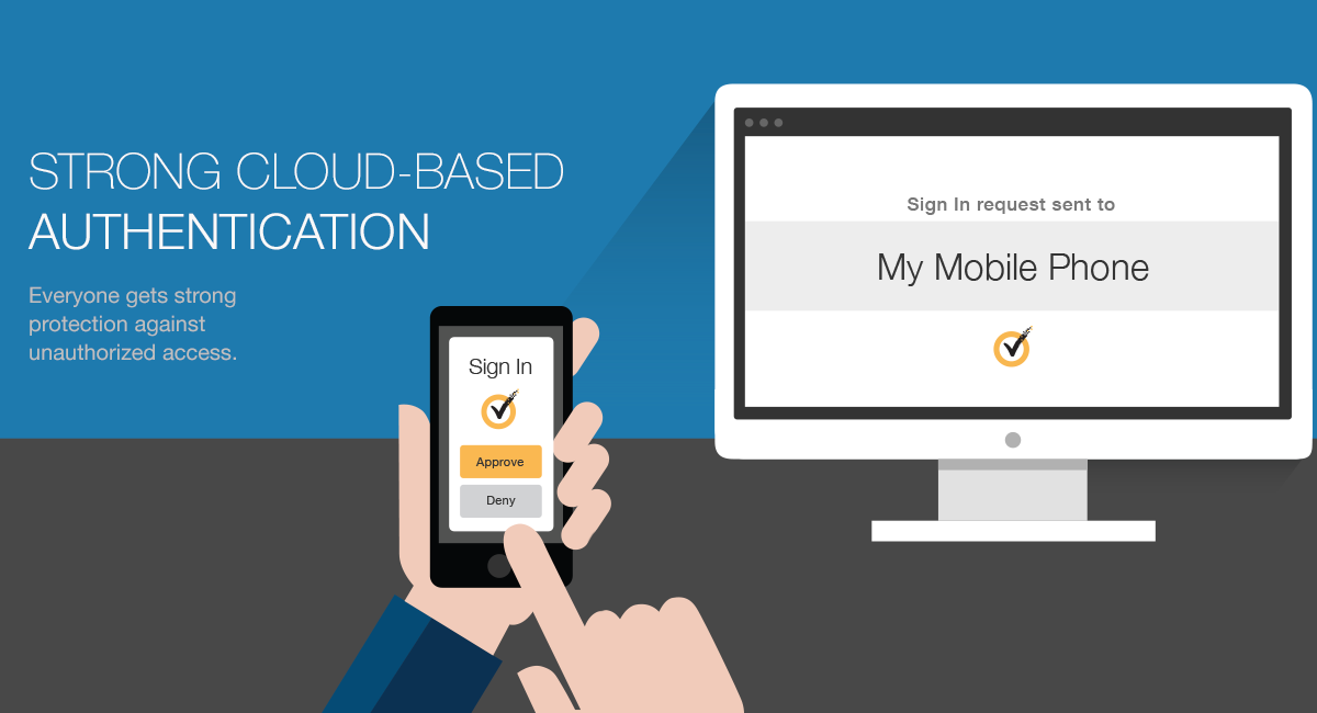
We first added push verification, which removed one annoying step from the login process (tacking on a code to the end of a network password). Next we delivered Touch ID, where you no longer needed to type in a password at all — just click a button on a website, get a push notification on your mobile device, and then tap your finger. 


Primary role: User Experience Manager

Secondary roles: UX designer, usability research

Design team: Vinoth Raghavan, Shirley Lee, Franklin Shaw

Contribution: I provided guidance on the overall strategy (brand alignment, design style, product vision). I facilitated and participated in conceptual design exercises, led collaboration with engineering, and conducted usability studies. 


A light-themed design motif was making its way through Symantec, but we knew that some of our end users used VIP Access in low light conditions (like logging into a network in the wee hours of the morning). Based on field research and customer feedback, we felt a dark theme was an important consideration. We looked at apps that were commonly used in low light, like an alarm on a phone, and we did color contrast research. 

We strive for simplicity in our usability tests, creating scenarios that are relatable and easy to follow. We recruited a wide range of participants, even some with cataracts or color blindness, and conducted our tests in a dark room. We tested different color and contrast combinations, and took note of the success rates. We also quizzed participants on what they noticed, and what worked best for them. It's important, we feel, to observe how someone uses the product, but also gather their thoughts and opinions. It is hard to determine what is best based on pure metrics, or pure opinion. We ended up launching a dark theme that was very well received by our end users (second from left). 

VIP Access Manager

When you work in enterprise software, get ready for vast differences in product user bases. How big? Well, some admin consoles could have 10 or so users. Total. That's because we might sell it to 4-5 companies, and the IT people working with the console can be counted with fingers and maybe toes.

Now take a single sign-on portal. This gets rolled out to every employee at a number of large companies, so now you're talking hundreds of thousands of users. It shouldn't change your design approach too much, but upper management tends to think UX time should be focused more on the bigger audience. 

So we got asked to redesign the SSO portal, and we were glad to do it. What you see for the "After" doesn't have all the aspects of our intended design, but it's close. We significantly simplified the filters, improved the visuals, and updated the iconography.

Primary role: User Experience Manager

Secondary roles: Usability research

Design team: Vinoth Raghavan, Douglas Campbell, Franklin Shaw

Contribution: I provided guidance on the user experience and visual style. I facilitated and participated in conceptual design exercises, and conducted usability studies. 


AFTER

BEFORE

MORE

Our team was asked to do a product microsite to help promote the single sign-on portal. I worked with a very talented designer on my team, Shirley Lee, to concept these three hero banners for the site. This was a side project with a tight turnaround, so we did a shortcut and purchased illustrations from iStock, and then she made significant changes to them. She is a good illustrator, but in a time bind, purchase and re-purpose can be effective.

Don’t make excuses. Test it.

Primary role: Director Experience Design

Design team: Craig Moore (manager), Sarah Rath (designer), and Antonio Gomes (researcher)

Contribution: Team building, prototype program, general guidance.

It can be hard to test products before launching them. I often hear things like: “We can’t do it without real customer data.” “A prototype will take way too long.” “How can we integrate a design prototype with real hardware?” Excuses are easy, but solutions can always be found… with effort. We were lucky to have Sarah Rath and Antonio Gomes on our team - an ambitious design and research duo - to take this project on. (If you’d like more detail on this project, please visit Sarah’s site).

The Pack Station is for warehouse workers picking and packing items for shipment. Scan an item with an RF gun, assign it to a shipping carton. This simple process includes at least two devices (gun and tablet/computer), and physical and virtual actions (using the gun and navigating through the UI).

The questio was: can we reproduce - to some degree - a scenario that mimics real life? Sarah and Antonio did. While Oracle NetSuite has fully embraced Figma for its collaboration advantages, it is always good to have another tool in your belt. Axure may not be the current design #apptrend, but there is little debate it can produce demonstrably more complex prototypes than Figma or Sketch. So it is not a question of either/or, but more choosing the right app for the job. We had built up Axure expertise on our team and established a training program just for this purpose.

Integrated Testing

Axure has html code that developers can work with, and the team was able to connect the RF gun to the prototype. Antonio and Sarah set up a mock staging area and invited customers to scan items and interact with the prototype.

They took this prototype on a roadshow, going into our customer’s workplaces and having them play with it. This surfaced additional feature ideas like a virtual keyboard and dark mode (when you visit a customer, everyone is reminded of their day to day reality, which could start quite early in the morning, hence the dark mode).

Onsite testing with customers

Brief video walk-through of the pack station for our customers.

There are a lot of things beyond talking thermostats and intelligent plushies.

The Internet of Things includes a bunch of fun and useful devices for daily living. Some are unnecessary extras, others show promise of real value.

But there are also connected devices used for critical infrastructure, healthcare, and industrial plants. These kinds of devices can control centrifuges, help monitor critically ill patients, and run assembly lines. 

Symantec's Anomaly Detection for Industrial Control Systems was built to monitor these vast subnets of connected devices. This is a very new and emerging product space, and we had to be ingenious and proactive to craft the right user experience for the product. It started with exploring the anomaly detection competitive landscape, and then establishing some personas...

Primary role: User Experience Manager

Secondary roles: Usability research, Content

Design team: Tim Holl

Contribution: I provided guidance on the overall strategy (style guide adherence, product usability, UI framework). I facilitated UX brainstorming sessions (particularly for topology interaction), led communication with upper management, and conducted usability studies. 

Assumption personas for a Nuclear Power Plant

Assumption personas for a Nuclear Power Plant

The lead designer (Tim Holl) mapped out the work flows for the product, and refined them over time working closely with the PM and getting feedback from an early beta customer. He has a lot more detail on his site about this project.

ICS Flow Diagram

ICS Flow Diagram

The biggest chunk of work, and the most interesting, was the topology interface. Tim researched a number of different interaction and design patterns, focusing on the usability and scalability of the UI (it needed to fit with customer work flows, and scale to accommodate anywhere from 10 to 10,000 devices). I worked closely with him on how the topology might work, focusing the team on what value the end user would gain from it. I helped forward the idea that line technicians would want to see groupings of devices that might be particularly important (like everything connected to a centrifuge).

A utility and design patent was filed for this topology, and I was part of the inventors for the utility patent. It can be a weird space for a UX manager, filling a nebulous role that could position you for all the credit or none. Good organizations surface and celebrate the accomplishments of individual contributors, while equalling recognizing the role managers play. Yes, I do believe I played a big part in the success of this project, but the bulk of credit goes to the talented UX designer. 

Topology Demo

With our research staff overloaded with other projects, Tim and I conducted a usability study ourselves, stretching our responsibilities to get this done. I took charge of writing the usability script, and facilitating the study. Tim crafted the test persona, built a really good step-by-step prototype in Axure, and helped run the test. The newness of the product made it difficult to recruit participants, so I helped find equivalent roles within Symantec. We have a team of security analysts in Virginia, and they were great "proxies" for our end user. 

Usability Prototype

Usability Prototype

We got really good feedback from the analysts, mainly confirming that our upfront research and work was on track. I'm super proud of the work Tim did on this project. From flow diagrams to icon design to research to prototyping, he demonstrated mastery of a wide range of skills to deliver the best possible UX. 

Product design is as much exploration as it is execution.

My team has done all kinds of work at Symantec, from thoroughly lab-tested end user products to conceptual designs for complex enterprise security solutions.  What you see here are rapidly created concepts that were shared with potential customers and partners. Some of the ideas here were scrapped, others made it into the product, and still more are queued up to be added later.

Primary role: User Experience Manager

Design team: Vinoth Raghavan

Contribution: I provided guidance on the overall concept, visual style, and helped brainstorm product features.

As with every other company, we're taking our products to the cloud. The interface above is a concept for how admins would scan and monitor confidential files. It's a robust Axure prototype that PM used to demonstrate the idea and solicit feedback.

We delivered this over a 3-week period with very loose requirements. Our design approach considered the need to illustrate use cases in  a contextual manner, meaning we didn't want the presenter clicking from page to page to page. Instead, we added sliding panels and modules that likely would be different in the real product. 

This is an early version of what is being called the "organism." It's a visual representation of connected devices. It also can be used for kill chains, where a security analyst can see how a virus made its way through their network.

With one glance, you can see what applications and servers a user is connected to, and where they may have put confidential data. 

We did not invent the radar graph, but we came up with an interesting version of it. This graph shows how an individual rates in a number of security risks. The pink is a risky employee (Fred), and the green is the average rating for the rest of his department. You can see that Fred rates pretty high for data exfiltration (moving files to insecure places).

We’re building that tower.

Primary role: Director Experience Design

Design team: Mike Zacheja, Dartis Willis

Contribution: Resourced project. Reviewed and provided feedback on concepts and final design.

The idea of a supply chain control tower is big. Getting full visibility of all the transactions in your end to end workflows - and using that data for fulfillment and short and long term planning - is a huge undertaking. SCM experts can debate what is required to call something a full-fledged control tower, but in the end you need to start somewhere, with something useful to your customers.

Oracle NetSuite is delivering on that promise, which will grow over time as does data collection. What I mean by that is, you can build it, but it will become more and more useful as the data pours in.

The control tower was one of our first efforts to deliver real value with AI/ML. Centering on predictive risk, we fed a ton of vendor data into the system to get things started. This is about goods being delivered, and the timeliness of the shipment. The screen below is from a demo you can find on YouTube that focuses on a fitness tracker. The system has predicted that a purchase order will be late. The options to correct this could be changing vendors, or just adjusting the date of the PO.

We worked with customers on what kind of information they wanted to see, and tested different ways of presenting it.

Shipped product

Early visual concept

This is a design exploration visualizing the delivery confidence for a particular vendor. The existing NetSuite patterns have many constraints, but as we improve the design system, our visualizations will get better and better. We also want to use natural language to explain the situation, instead of just presenting raw data (ex. “If you switch the PO to BetaTek, you’ll get the trackers in time to fulfill your June sales orders.”). Getting the balance between natural language and easily scannable data will take some extra attention, but we’re committed to delivering actionable insights that make sense.

Data concept


Early wireframe exploration of information that could be useful, like P&L impact, time loss, customer(s) affected. etc.

We are now in the position to significantly modernize the visual designs, but ultimately, like true UX designers, we put priority on the product solution over aesthetics.

This is a medium fidelity mock-up used to explore ideas. While this stayed somewhat true to the legacy NetSuite design patterns, a few new things were introduced to drive conversation. When looking at risk, you obviously want to know if something will be late or not, but knowing the impact of that miss is even more important. Can you predict P&L impact? Should you surface what customers are affected, and maybe if they’re preferred or critical to your business?

Supply chain snapshot

The predicted risk portlet helps with managing your supply chain in the now. But what about planning? Good planning can minimize disruptions down the line by better anticipating future demand and supply.

The supply chain snapshot makes this possible by simulating future supply and demand across your business. By analyzing the inventory impact of current and past due transactions, you can create forecasting simulations to better prepare for the future.

Turns out people don't like anyone messing with their money.

I worked with some really smart folks in the Risk org at PayPal, but their central focus was not the user experience, it was losses. Their performance hinged on limiting the shrinkage, so sometimes they didn't think through how this affected the end user. They'd slap holds on people's funds, for a variety of risk factors, and people would go apoplectic. 

My team helped improve the UX, from better messaging to removing unnecessary steps that weren't relevant to nearly all users.

The visual design here is dated, but that was the PayPal style of the day. : )

My team convinced the Risk group to drop these "selling" goals because data showed they weren't relevant for most people stuck in holds.

My team convinced the Risk group to drop these "selling" goals because data showed they weren't relevant for most people stuck in holds.

We improved the identity experience by allowing the user to add a new phone number and do the whole thing through SMS if they wanted.

We improved the identity experience by allowing the user to add a new phone number and do the whole thing through SMS if they wanted.

The unwinnable walkman war

Back in 2005 when I was a merchandising manager at Sony — somewhere between a product and design manager — I had the good and bad fortune of owning the portable audio pages on SonyStyle.com. Sony was getting its ATRAC handed to it by Apple, and there was nothing our US-based Sony site could do about it. We'd release a Walkman with an LCD screen, Apple would have color. We'd have 256MB memory, they'd have a GB. And so on. The home office knew each offering wasn't going to sell, so they provided zero online marketing budget. 

I was on a team of really talented people, with guys going on to found design firms and be VPs at major motion picture studios, so it was a delight and great learning experience to work with them. We came up with the below campaign in a week, putting all our chips on the one advantage we had over Apple — battery life. Sony players lasted significantly longer than competitors, so we focused on what a person could do during that extended play time. I was able to sneak in some edgy content like "drown out mom" and "grind every curb in Burbank." I'm still proud of that.

Sales were slim compared to Apple, but we actually went well above forecast, and upper management was impressed.

We really hammered home the battery life advantage, all the way down to the item level pages. Believe it or not, the Sony Style website was pretty slick for its time. 

We improved the identity experience by allowing the user to add a new phone number and do the whole thing through SMS if they wanted.

And the battery beat continued on with the hard drive player that also could not compete with Apple. Can't say we didn't try!

My team convinced the Risk group to drop these "selling" goals because data showed they weren't relevant for most people stuck in holds.

Revamping the Resolution Center

Some years back, PayPal struck a deal with Discover to make a bigger move into the brick and mortar space. 

The Risk group wanted to update the Resolution Center so it could align with the dispute process for credit card companies.

The Resolution Center had been limping along with reason codes that were too limiting ("Item not received" and "Not as Described" weren't enough).


We did research and user testing to work through a complicated issue reporting flow. The work we did laid the foundation for a complete overhaul of the resolution center that came years later. Sometimes the payoff is delayed, or your reward was the pride in the work you did even if it didn’t ship right away. : )

Email apps are dense.

Most of us are in Microsoft Outlook 8 hours a day, 5 days a week. It gets really really familiar, and the sheer breadth of it doesn't really sink in. But, let me tell you, email applications are DEEP. Especially when you're doing the UX for them.

I inherited this mobile mail project about halfway through. I got a good education in how these patterns translate into the Android world. I can't say I love the color palette used here, but it has been the style for Symantec and Norton consumer products for some time.

The Touchdown email app was particularly robust, because people would buy it for extra features they can't find anywhere else (like setting unique vibration alerts for new mail, events, etc.)