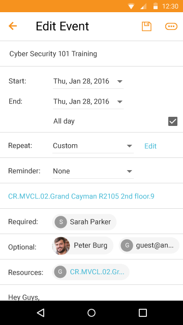
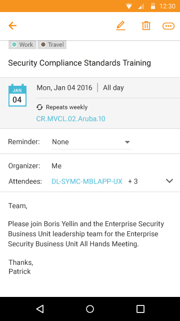
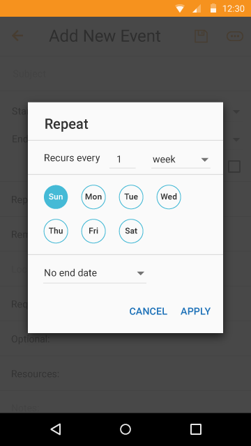
Email apps are dense.
Most of us are in Microsoft Outlook 8 hours a day, 5 days a week. It gets really really familiar, and the sheer breadth of it doesn't really sink in. But, let me tell you, email applications are DEEP. Especially when you're doing the UX for them.
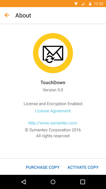
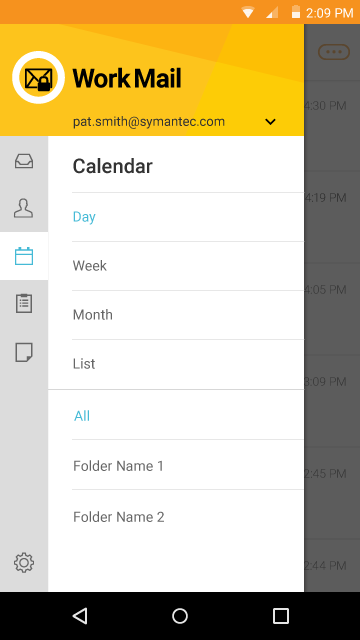
I inherited this mobile mail project about halfway through. I got a good education in how these patterns translate into the Android world. I can't say I love the color palette used here, but it has been the style for Symantec and Norton consumer products for some time.
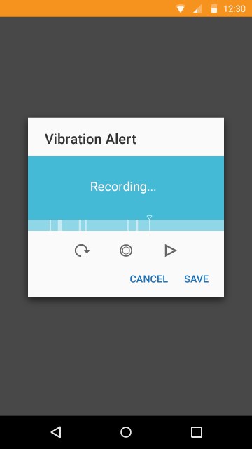
The Touchdown email app was particularly robust, because people would buy it for extra features they can't find anywhere else (like setting unique vibration alerts for new mail, events, etc.)